
Palladio is a visualization tool that can be used to analyze relationships between different elements, depicted as points (nodes). The lines representing the relationships between the nodes are called edges or links. Palladio is very user friendly and it is easy to switch perspectives quickly. For example, the screenshot at the top of this post depicts the relationships between the interviewers of the Alabama WPA Slave Narratives and the type of former slave interviewed. This information comes from a database that contains other relevant details. If a user would rather examine the relationships between the interviewer and the gender of the interview subjects, the user could edit the settings on the graph in less than a minute and view the relationships from that perspective.
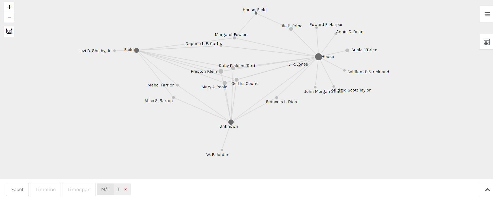
Additionally, Palladio allows users to add further filters onto the main relationships depicted on the graph between 2 nodes. Returning to the original network depicted in the screenshot at the top of the post – the relationship between interviewers and types of former slaves interviewed. The network could be slimmed down even more by filtering the nodes so that only interviewers of a certain gender are represented (see below).
To get started with this tool, upload a spreadsheet. Once a single spreadsheet is added, additional spreadsheets can be added via dimensions in the primary table. Then visit the “Graph” tab in the top left corner and click on the settings box (3 lines). Select your source and target fields (Interviewer/Type of Slave), then decide if you want one set of nodes to be highlighted (which allows for easier reading of the graph. The size of the nodes can also be adjusted in this area. After that, the graph is ready for viewing and use. If modifications to the source and target fields need to be made, the user can return to the settings box and make those changes easily.