Accessibility is a key component of digital public history. The Oral History Metadata Synchronizer (OHMS) is an exceptional tool that can be used to share oral history projects with online users. At the heart of the tool is the OHMS viewer, which allows users to watch/listen to video/audio of an interview, while simultaneously accessing a timestamped transcript and index (if made available by the uploader). The viewer also includes a search function.
Once an account is created with OHMS, uploading interviews and indexing them is simple. Under the “Interviews” page upon logging in, click on the “+New” button in the upper right hand corner. The “Metadata Editor” form will appear. Audio and video content can be uploaded through this screen. At the bare minimum, this form requires an interview title and media information about the interview. The form can be saved and edited at any time.
In order to index an uploaded interview, return to the “Interviews” page. To the right of the newly added interview, in the “Index” column, click the “Index” link. The “Tag Data” screen will appear. The interview should be embedded on the page, which makes it easy for users to index the project as they go. To add an annotation, click “Tag Now.” The timestamp field will auto-populate with the last time in the interview that was played (or a few seconds before) when the “Tag Now” button was clicked. Users can include information about the interview segment they would like to annotate. Once done editing, the tag is saved. Users can easily return to this screen to add and edit tags.
To export the interview in the OHMS viewer, return to the “Interviews” page and select the correct format under the “Export” column. To embed the interview in WordPress, first install the “OHMS Viewer” application, then upload the XML/CSV file into the OHMS Viewer cache. Below is an example of an oral history interview that has been indexed through OHMS.
After working with Voyant, kepler.gl and Palladio, I feel like I have a better understanding of the kind of data that each tool works best with, some of the weaknesses of each tool, and how the tools can be used together. Voyant is meant to be used primarily with textual data. At the bare minimum, kepler.gl requires geographical coordinates. Palladio works to visualize relationships between different elements within a dataset or datasets and emphasizes the interconnectedness of those elements.
Shortly after completing the Voyant module, I learned about a research project involving the textual analysis of 16 of Agatha Christie’s mystery novels. Dr. Ian Lancashire used two different pieces of software (Concordance and Text Analysis Computing Tools) to analyze Christie’s writing and make observations about the author’s vocabulary size and how it changed throughout her career. The results of the analysis led Lancashire and other researchers to theorize that Christie suffered from undiagnosed dementia at the tail end of her writing career. This example showcases the importance of textual analysis tools like Voyant; the ability to organize text in new and different ways allows researchers to view data from new perspectives and generate new questions and theories. A word of warning though – users of Voyant (and really any digital humanities tool) should still question any new patterns brought to light by the software. For example, a quick analysis of Franz Kafka’s book The Metamorphosis in Voyant displays words like “father”, “sister”, “mother”, and “family” as some of the top words in the work. It wouldn’t be a crazy jump for someone who has never read the book to conclude based on this data alone that Kafka’s work is a touching tale about a man’s family. This scenario hits home that context matters, which is why Voyant has included a “Context” view.
Words that appear most frequently in Franz Kafka’s “The Metamorphosis”, not including stop words. Via Voyant and Project Gutenberg.
The overlap between Voyant and kepler.gl (and other GIS analysis tools) is clear: as long as a dataset contains text and geographical locations, both tools can be utilized. Take for example, the Authorial London project which maps locations in London referenced in literature. If a user wanted to analyze literary works by Charles Dickens, they could input his works into Voyant and analyze the texts that way. But GIS tools can provide a different perspective on the same set of information. Using Authorial London, a researcher can easily view a map of the locations Dickens references in his works, including the overlap in places he had personal connections to. The use of both textual analysis tools and GIS tools paints a fuller picture for researchers and provides new perspectives that previously would have been difficult to achieve. In my opinion, kepler.gl is superior to the software used in Authorial London because of the flexibility it provides its users, especially with the easy-to-manipulate filters and layers functions.
Palladio is unique in that, in addition to offering graphical visualizations of networks, it also offers a map visualization of the same dataset. The map function of Palladio doesn’t seem to be its strongest feature, so it makes sense that if a researcher wanted to examine data from a network perspective as well as a geographical perspective, that researcher would utilize both Palladio and kepler.gl. For me, Palladio and the module about network analysis was the most challenging to wrap my mind around. It’s easier for me to see the value in network analysis when examining relationships between people and another element (other people, locations, events, topics, etc.). A great example of this is the Digital Yoknapatawpha project and the visualizations included there analyzing the networks between characters in William Faulkner’s works and other elements in the author’s novels (locations, other characters, events). Examining relationships between non-individuals (as we did with the locations and interview topics in the WPA Alabama Slave Narratives exercise) muddies the waters for me a little bit, but perhaps things will become more clear with further exposure and practice. I was also very aware of some ease-of-use shortfalls concerning Palladio. Coming from kepler.gl which made it easy to color-code points on the visualization, options to do so were severely limited in Palladio.
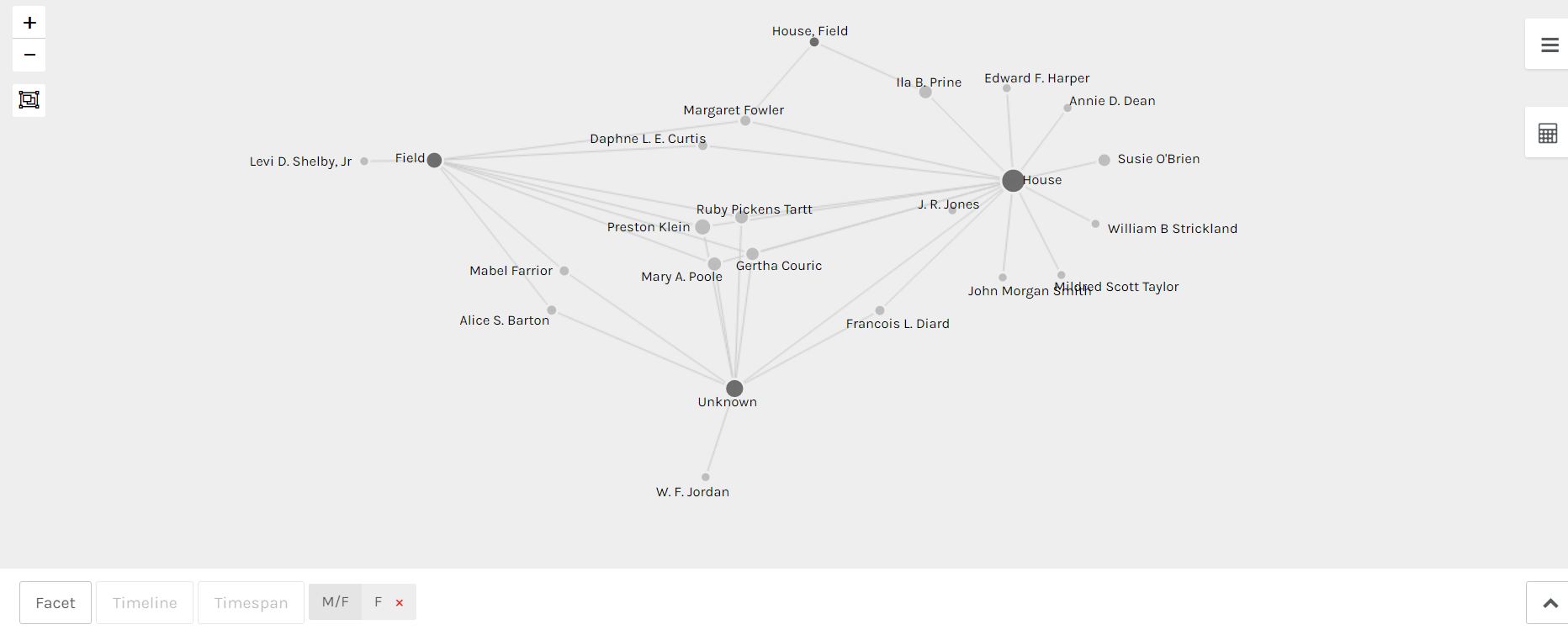
Palladio network depicting relationship between Alabama WPA Slave Narrative interviewers and slave type interviewed (house/field/unknown/house, field).
Palladio is a visualization tool that can be used to analyze relationships between different elements, depicted as points (nodes). The lines representing the relationships between the nodes are called edges or links. Palladio is very user friendly and it is easy to switch perspectives quickly. For example, the screenshot at the top of this post depicts the relationships between the interviewers of the Alabama WPA Slave Narratives and the type of former slave interviewed. This information comes from a database that contains other relevant details. If a user would rather examine the relationships between the interviewer and the gender of the interview subjects, the user could edit the settings on the graph in less than a minute and view the relationships from that perspective.
Additionally, Palladio allows users to add further filters onto the main relationships depicted on the graph between 2 nodes. Returning to the original network depicted in the screenshot at the top of the post – the relationship between interviewers and types of former slaves interviewed. The network could be slimmed down even more by filtering the nodes so that only interviewers of a certain gender are represented (see below).
Palladio network depicting relationship between female Alabama WPA Slave Narrative interviewers and slave type interviewed (house/field/unknown/house, field).
To get started with this tool, upload a spreadsheet. Once a single spreadsheet is added, additional spreadsheets can be added via dimensions in the primary table. Then visit the “Graph” tab in the top left corner and click on the settings box (3 lines). Select your source and target fields (Interviewer/Type of Slave), then decide if you want one set of nodes to be highlighted (which allows for easier reading of the graph. The size of the nodes can also be adjusted in this area. After that, the graph is ready for viewing and use. If modifications to the source and target fields need to be made, the user can return to the settings box and make those changes easily.
Kepler.gl is an online mapping tool that allows users to input geographic data and its accompanying contextual information in order to create maps to aid in the research process. In the demo edition, Kepler.gl has 2 tools that empower users to view data from different perspectives: the layers function and the filters function. The layers function allows users to input multiple databases that can then be linked to each other and to geographic spaces. It’s a bit obvious to state it, but the filter function enables users to filter data based on category or categories listed in the databases.
The best way to learn what can be done with Kepler.gl is through experimentation. All that is needed is a simple database (think Excel) that includes latitudinal and longitudinal coordinates along with some basic information tied to those coordinates. In my first experience with Kepler.gl, I worked with a database compiled using the metadata of the WPA Slave Narratives. The database contained information about the person being interviewed (name, age, male or female, place of birth), information on the experience of the person’s life in slavery (location of enslavement, field or house slave), and information on the interview itself (date and location). Below is a simple point map that outlines the interview locations for the state of Alabama. This was achieved by inputting a basic Excel database via the “Layers” tab and selecting the “Point” format, then indicating that the points in the map should be informed by the latitude and longitude columns in the database.
Simple point map in Kepler.gl, Interview Locations in Alabama, WPA Slave Narratives.
Another stand-out feature was the “Heatmap” format, also under the “Layers” tab. Similar to the point layout, this template does an excellent job of displaying density, something that the simple point view cannot accomplish well.
Heatmap in Kepler.gl, Interview Locations in Alabama, WPA Slave Narratives.
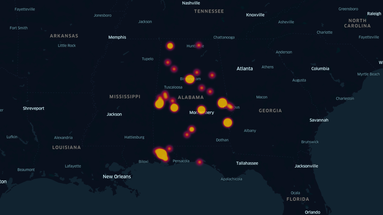
Moving on to the “Filters” tab – the best use of this probably includes entering the same database more than once (or multiple different databases). For example, to quickly view which of the interviews conducted in Alabama for the WPA Narratives centered on former field slaves versus former house slaves, the same database would need to be input twice. Then, under the “Filters” tab, new filters could be added for type of slave – one for field slaves and one for house slaves. By customizing the colors or sizes of the points, users of the map can quickly see the quantity of interviews for each type of slave along with the distribution among the state.
House slave interviews and field slave interviews in Kepler.gl, WPA Slave Narratives of Alabama.
The two most advanced map views (to me, at least) were the time filter under the “Filters” tab (seen below) and the Arc/Line format under the “Layers” tab (an interactive line view is embedded at the top of this post). The Arc and Line formats created a literal connection between 2 datasets – the location of the interview and the location(s) of enslavement of the people being interviewed.
Simple point map using a time filter in Kepler.gl, Interview Locations in Alabama, WPA Slave Narratives.
As I was exploring Kepler.gl with the WPA database, each new feature led me to new questions and new hypotheses. For example, what was the reason behind the differences in the amount of field slave interviews and house slave interviews? What route did interviewers take when conducting interviews across the state? How many interviewers were operating at once? How did the current events of January 1937 impact the way an interviewer conducted an interview? Were those events and impacts substantially different from those of June 1937?
Based on my experience with mapping and specifically with Kepler.gl, I believe that geospatial tools are meant to stimulate engagement with information and data sources in ways that encourage users to create new theories and put them to the test.
Voyant is an online textual analysis tool that allows users to discover patterns in texts or collections of texts. Some of the patterns Voyant can spotlight include: how frequently a word occurs in a single document or throughout a corpus, words that appear most frequently, differences in word frequency between documents, and a list of a document’s most distinctive words (compared to the rest of the corpus).
Voyant trend graph depicting the frequency of the word “good” in the WPA Slave Narratives, categorized by document (in this case, the narratives of different states).
This tool is an excellent resource for researchers and users of a variety of backgrounds. Upon first use, individuals should begin by exploring the 5 different Voyant views that are displayed once a text is fed into the system (Cirrus, Reader, Document Terms, Summary, and Contexts). It is probably a good idea to become familiar with the system by first using a low-stakes corpus. Once the text is in the system, users should begin their exploration with Cirrus (word cloud). In order to represent more meaningful patterns, users can input a list of “stopwords” that occur frequently throughout the document but don’t provide significant insight (examples: the, a, it) so Voyant will filter these words out and exclude them from the results.
Voyant list of most frequent terms in the WPA Narrative corpus.
After this, users can begin to explore patterns on a deeper level. The Trends function can display patterns of a word or words over the entire corpus or a single document. The Contexts view is especially useful in providing more information about the patterns presented in Trends and Cirrus. For example, if the word “good” appears in the top 10 most frequent words, a researcher may initially hypothesize that the document overall contains positive connotations. To follow up on this theory, the researcher can use the Context function to view every incident of the word “good” in the corpus or document, along with the words on either side of it.
If most of the incidents of the word “good” appear in contexts that appear positive (“we had a…good…time at the party”), this lends support to the initial hypothesis. But if the contexts appear more negative (“he gave me a…good…whipping after that”), this allows the researcher to reform their thoughts on the significance of the word “good” in the document.
Tropy’s generic metadata template contains the following fields: title, creator, date, type, source, collection, box, folder, identifier, and rights. Recording this information for resources is important for a number of reasons.
Tropy screenshot depicting customized template.
First and foremost, it increases the findability of a resource. It’s possible that months and years may pass between a user’s initial interaction with a resource and the moment that the user will need to revisit the resource in a more meaningful way. If the metadata for the resource is extensive, the resource will be able to be located through a variety of searches. If the metadata for a resource is bare bones (only consisting of one or two fields), the odds decrease that the user will be able to search for that resource in a way that exactly matches the slim metadata information.
Tropy screenshot depicting customized template.
Additionally, providing a wealth of context about the resource increases the ability for that resource to be used in a meaningful way. Knowing that 2 documents were grouped in the same box or created on the same date can provide the user with insights that may prove valuable to their research.
Finally, investing time and effort on the front-end of resource management saves time and effort on the back-end, when researchers are already burdened with a host of other priorities. Digging for missing metadata months or years after the initial interaction with a resource can be very difficult and time consuming. It’s easier to record that information the day it becomes available, which is usually the day that the resource is first interacted with.
Tropy screenshot depicting customized template.
While Tropy’s generic template is a good starting point, Tropy users may benefit from creating a customized template and including the following fields: subject, location created, location shown, and format. (See photos in this post for examples of a customized Tropy metadata template.) The first 3 fields can help increase the discoverability of a resource. The last field provides important administrative metadata. If possible, information should also be provided to users on the digitization and editing process of the resource.