Kepler.gl is an online mapping tool that allows users to input geographic data and its accompanying contextual information in order to create maps to aid in the research process. In the demo edition, Kepler.gl has 2 tools that empower users to view data from different perspectives: the layers function and the filters function. The layers function allows users to input multiple databases that can then be linked to each other and to geographic spaces. It’s a bit obvious to state it, but the filter function enables users to filter data based on category or categories listed in the databases.
The best way to learn what can be done with Kepler.gl is through experimentation. All that is needed is a simple database (think Excel) that includes latitudinal and longitudinal coordinates along with some basic information tied to those coordinates. In my first experience with Kepler.gl, I worked with a database compiled using the metadata of the WPA Slave Narratives. The database contained information about the person being interviewed (name, age, male or female, place of birth), information on the experience of the person’s life in slavery (location of enslavement, field or house slave), and information on the interview itself (date and location). Below is a simple point map that outlines the interview locations for the state of Alabama. This was achieved by inputting a basic Excel database via the “Layers” tab and selecting the “Point” format, then indicating that the points in the map should be informed by the latitude and longitude columns in the database.

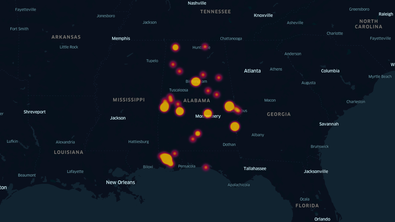
Another stand-out feature was the “Heatmap” format, also under the “Layers” tab. Similar to the point layout, this template does an excellent job of displaying density, something that the simple point view cannot accomplish well.
Moving on to the “Filters” tab – the best use of this probably includes entering the same database more than once (or multiple different databases). For example, to quickly view which of the interviews conducted in Alabama for the WPA Narratives centered on former field slaves versus former house slaves, the same database would need to be input twice. Then, under the “Filters” tab, new filters could be added for type of slave – one for field slaves and one for house slaves. By customizing the colors or sizes of the points, users of the map can quickly see the quantity of interviews for each type of slave along with the distribution among the state.

The two most advanced map views (to me, at least) were the time filter under the “Filters” tab (seen below) and the Arc/Line format under the “Layers” tab (an interactive line view is embedded at the top of this post). The Arc and Line formats created a literal connection between 2 datasets – the location of the interview and the location(s) of enslavement of the people being interviewed.

As I was exploring Kepler.gl with the WPA database, each new feature led me to new questions and new hypotheses. For example, what was the reason behind the differences in the amount of field slave interviews and house slave interviews? What route did interviewers take when conducting interviews across the state? How many interviewers were operating at once? How did the current events of January 1937 impact the way an interviewer conducted an interview? Were those events and impacts substantially different from those of June 1937?
Based on my experience with mapping and specifically with Kepler.gl, I believe that geospatial tools are meant to stimulate engagement with information and data sources in ways that encourage users to create new theories and put them to the test.